clamp(1rem, -2.764rem + 16.731vw, 11.875rem)
Slope: N/A
Base: N/A
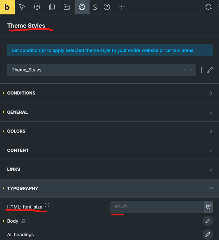
Bricks Builder <HTML> Root Font Size Setting
It is very important that you match your Root Font Size with the tools font size. I usualy set this to 16px or 14px
How does it work?
.

(font size)
     |
  F  |        * (max size at max viewport)
  o  |       /
  n  |      /
  t  |     / <-- The line going up is determined by SLOPE and BASE
     |    /
  S  |   /
  i  |  /
  z  | /
  e  |/  *(min size at min viewport)
     +-------------------------- (viewport width)
        minViewport         maxViewport

.
Important Note: Your clamp calculation inherits from root font-size and calculated from your <html> font size. Everyting in web browsers gets calculated from pixels first and after that relative units gets calculated. If you didnt set your html font size yet default browser html font size will be your root font size thats usualy is 16px. This is easy to change if you wish just change your html font size setting if there is none write a css like this html{font-size:16px} thats it.
This tool helps you create a special CSS font sizing rule using clamp(). By typing in minimum and maximum font sizes, and the smallest and largest viewport sizes, it will give you a clamp() formula. This formula makes your font size grow smoothly as the screen gets bigger, but never too small or too large.
How It Works:
- Give It Numbers: You enter:
- A small font size (for small screens)
- A large font size (for big screens)
- A small viewport width (when the font should be at its smallest)
- A large viewport width (when the font should be at its largest)
- A root font size (usually 16px)
- Automatic Math: The tool calculates a slope and a base value. Don’t worry about what these mean too much; it just figures out how quickly and smoothly the font should get bigger.
- Instant Results: It shows you a
clamp()rule like this:clamp(min-rem, base-rem + slope-vw, max-rem)You can copy this and use it in your CSS. Your text will then grow smoothly between your chosen minimum and maximum sizes, depending on the screen width.
In short, this tool takes a few numbers from you and returns a ready-to-use CSS rule that keeps your text nicely responsive.
Browser Compatibility: https://developer.mozilla.org/en-US/docs/Web/CSS/clamp#browser_compatibility